Who has all the US Treasuries? Not the Dealers.
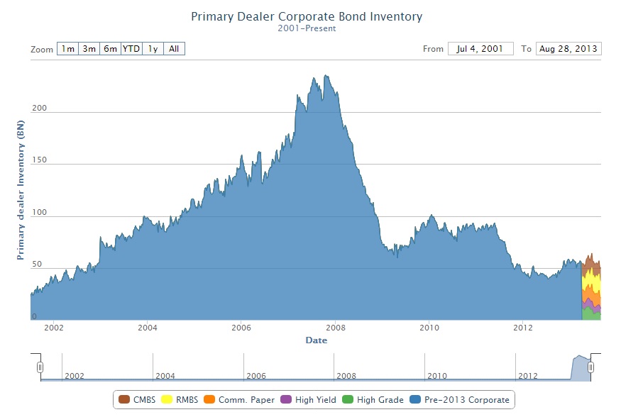
Those of us tracking the broader fixed income market have become quite familiar with the chart showing dealer inventories of corporate bonds falling through the floor, but this chart of bank US Treasury holdings totally blew me away.

Source: US Federal Reserve, Greenwich Associates
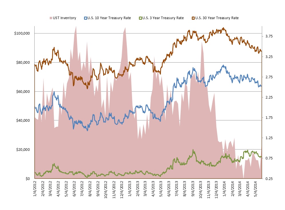
The pink area is the US Treasury holdings of the primary dealers, and the blue the 10 year Treasury rate. Some of the dips in the chart have logical explanations. When the Fed began to taper in early 2013 inventories dropped, for example. But reasoning behind the latest bottoming out of primary dealer US Treasury holdings that began in the fall of 2013 is much less clear. The drop started as the market was preparing for Janet Yellen to take over the Fed – although that’s likely correlation rather than causation. Rates were rising at that time which is a much more likely expectation, but rates have since dropped back down while inventories have continued their decline which makes that theory less likely.
Looking at at the holdings a little more closely you can see that banks are mostly shedding the middle part of the curve and hanging onto short term and longer term bonds which does look a bit more like long term positioning, but it can't be that simple. That brings us to the cost of capital. Holding US Treasuries used to be like holding cash, but it is not that simple anymore. Don’t forget US debt is not viewed as risk free by everyone anymore. And with major banks talking agency model as a big part of their go-forward fixed income strategy, the need to hold inventory becomes less and less important. The bigger question – is this cyclical or structural change? Honestly – I just don’t know.
It is too hard to tease out economic influence from regulatory influence, as we've never had a time of such massive change on both fronts at the same time. That said if you examine bank US Treasury holdings between 2004 and 2009 they are net negative for the majority of that period - so are we just going back to "normal"? Whatever the reason, this chart tells me times are changing. US Treasuries are one of – if not the – most liquid markets in the world, and major banks are holding only $5 billion dollars of the $14 trillion dollars outstanding. New liquidity providers? New liquidity platforms? A reversion back to pre-crisis norms? Only time will tell.
Theories? Questions? Comments? Comment below, tweet me or e-mail me.